Harman Phoenix 200: Impressions and Workflow
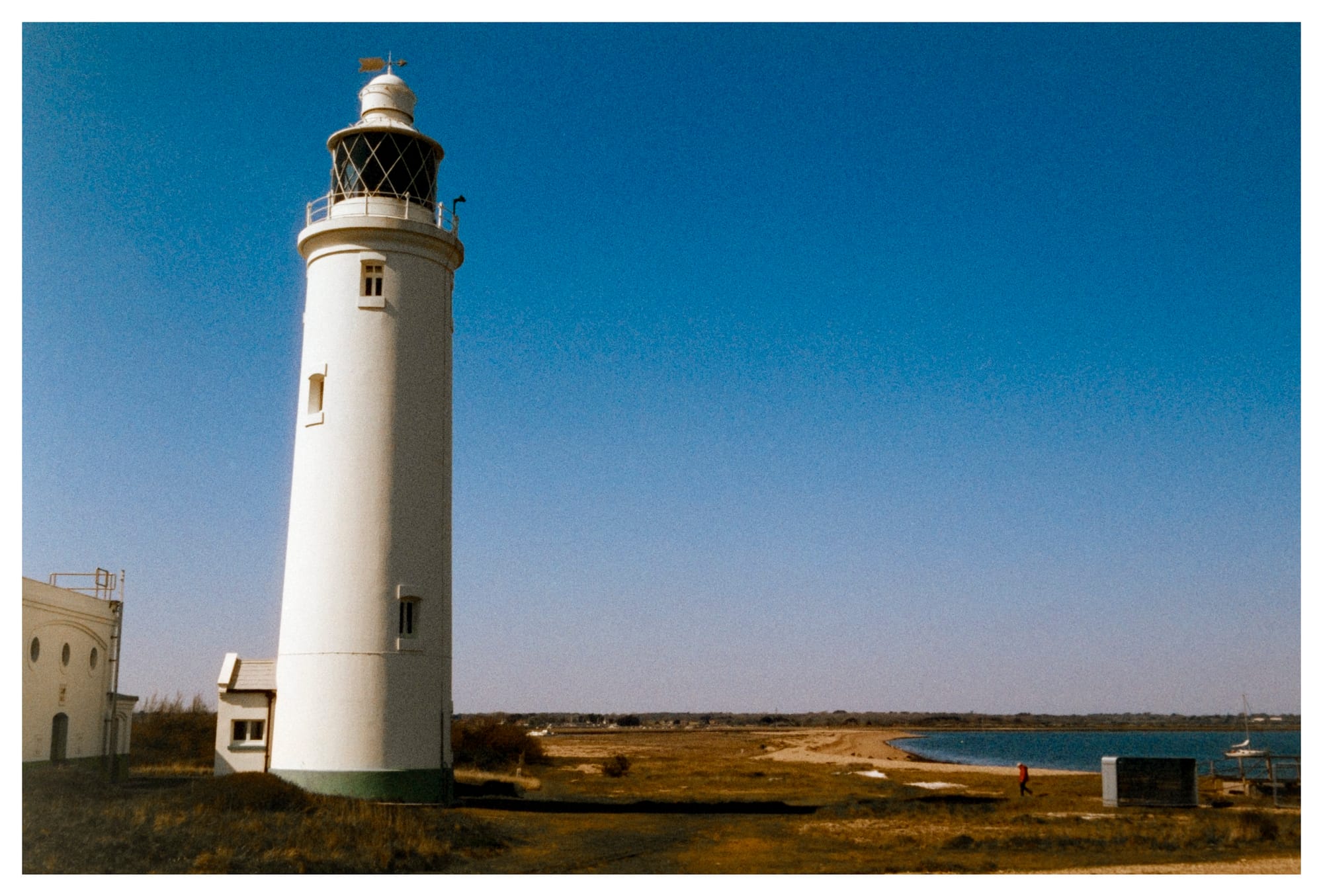
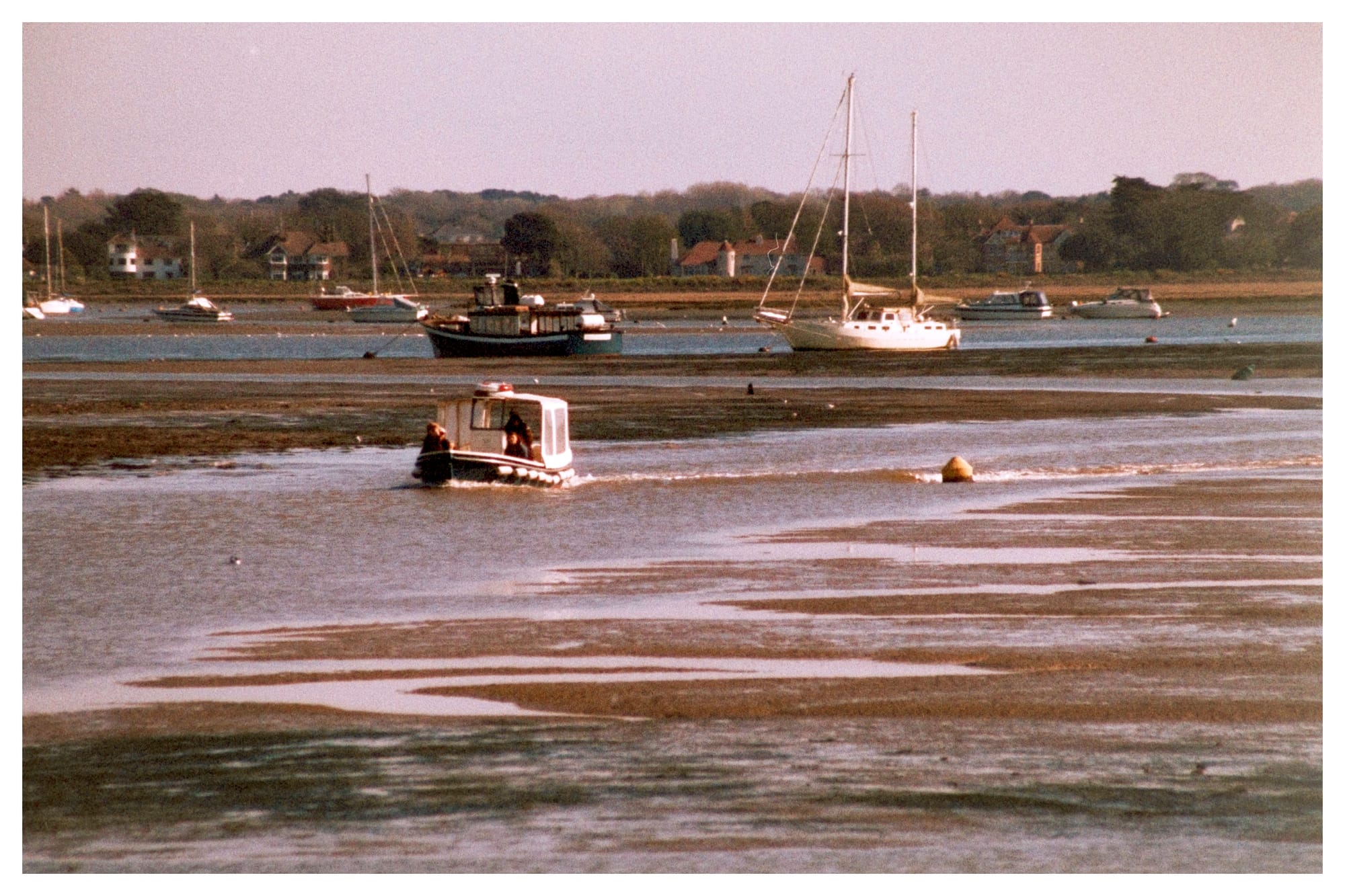
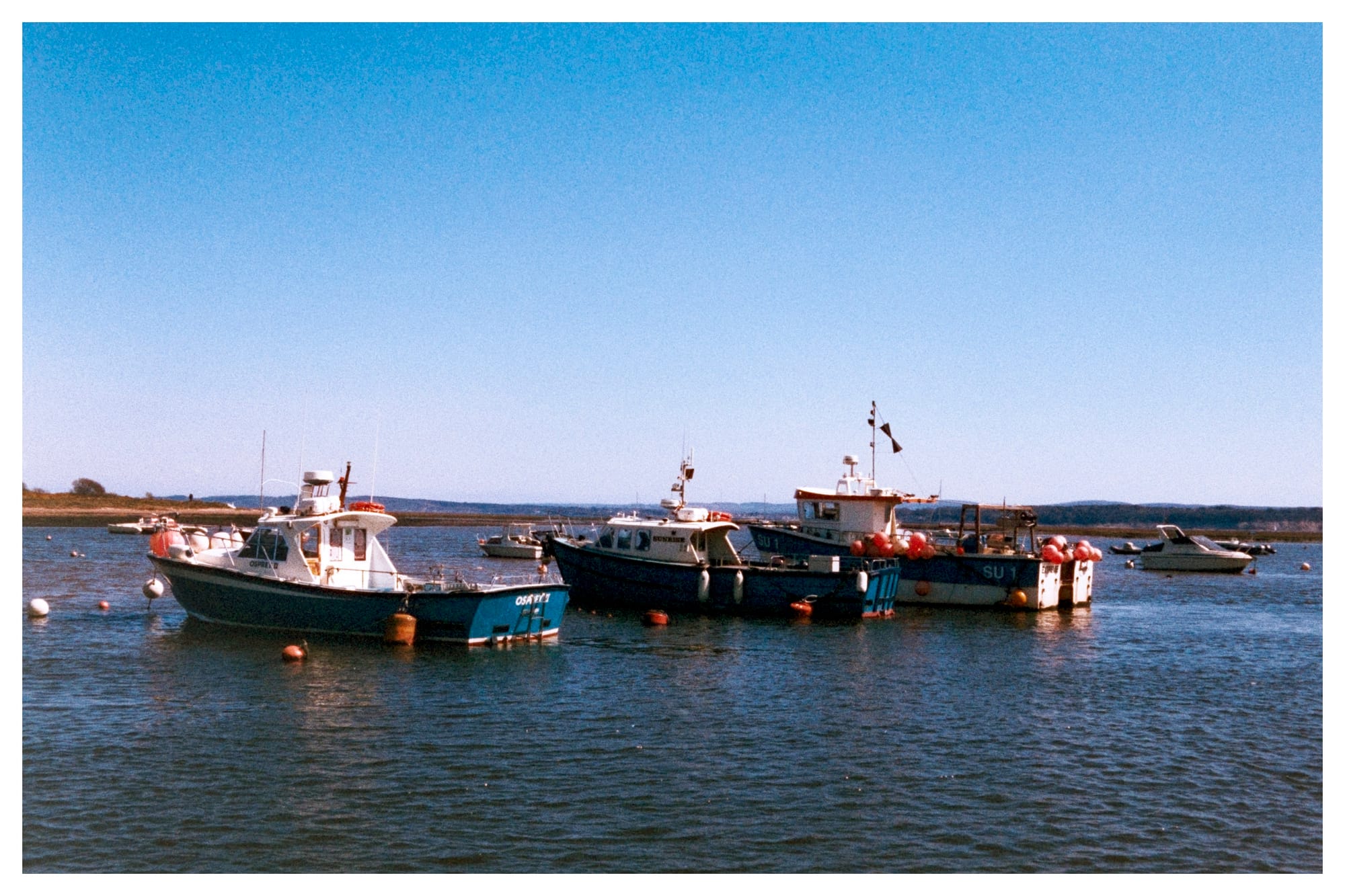
Over the past few weeks, I’ve been testing Harman Phoenix 200, a colour negative film stock from Harman Photo, on a Canon EOS 30 paired with the EF 40mm f/2.8 STM. This is my first roll through the camera on this emulsion. I chose to shoot in a variety of coastal and natural locations under clear spring light. The aim was to see how the film handles contrast, shadow detail, and colour rendering in strong daylight (plus it was a nice day out with the family).
Shooting Experience
The Canon EOS 30 is a responsive 35mm body with reliable metering and smooth autofocus, which suits casual shooting. The compact 40mm f/2.8 worked well in these scenes—versatile enough for wide landscapes, tighter portraits, and shoreline detail.
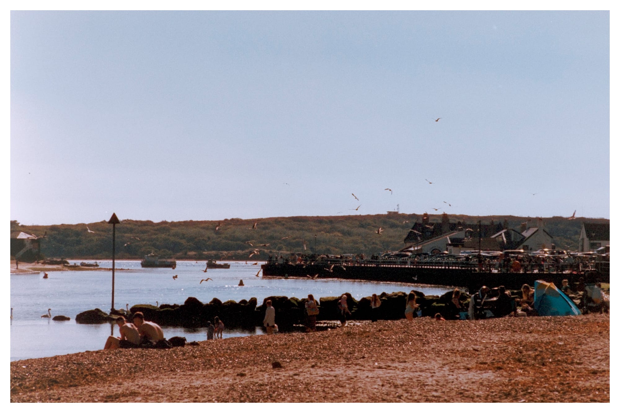
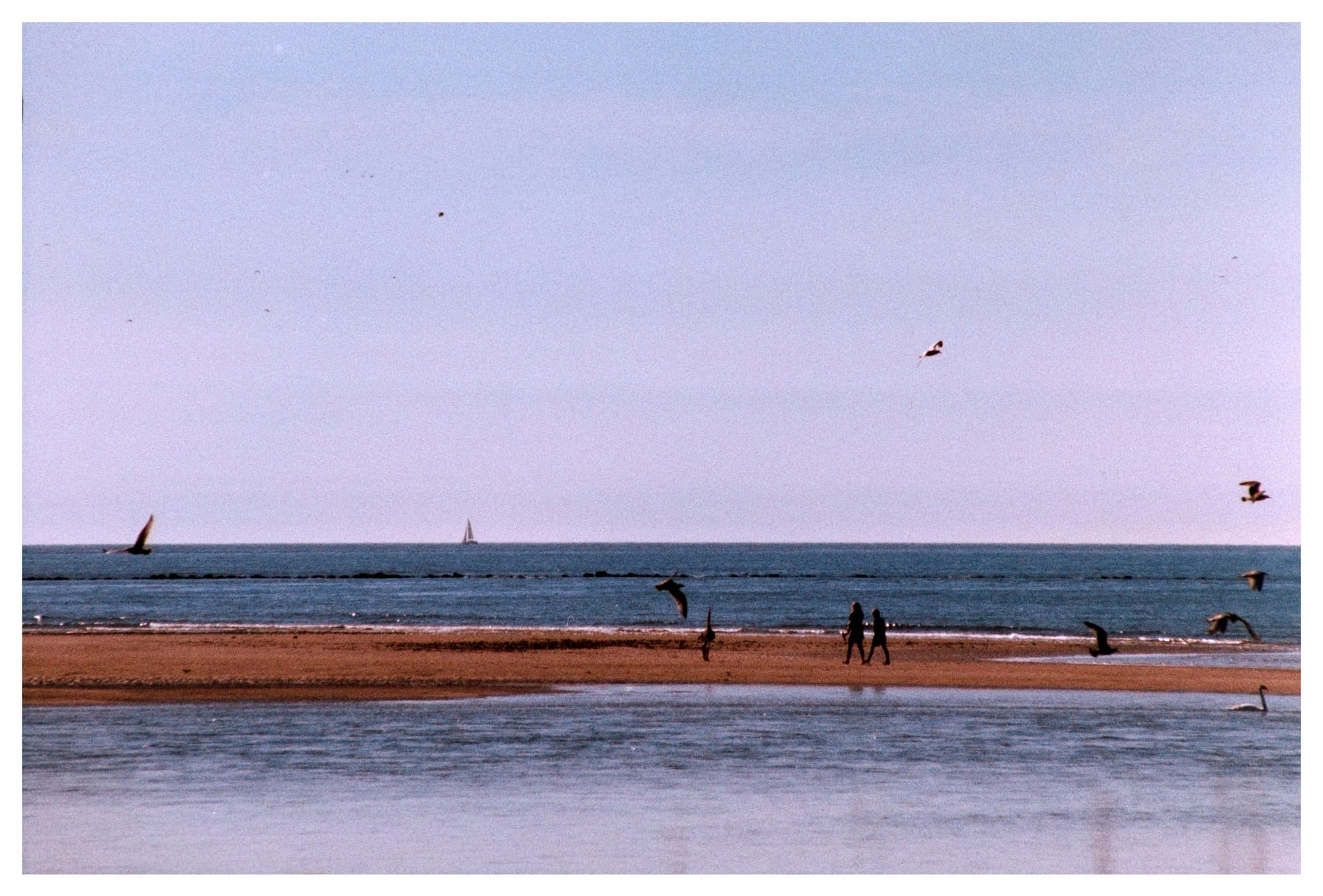
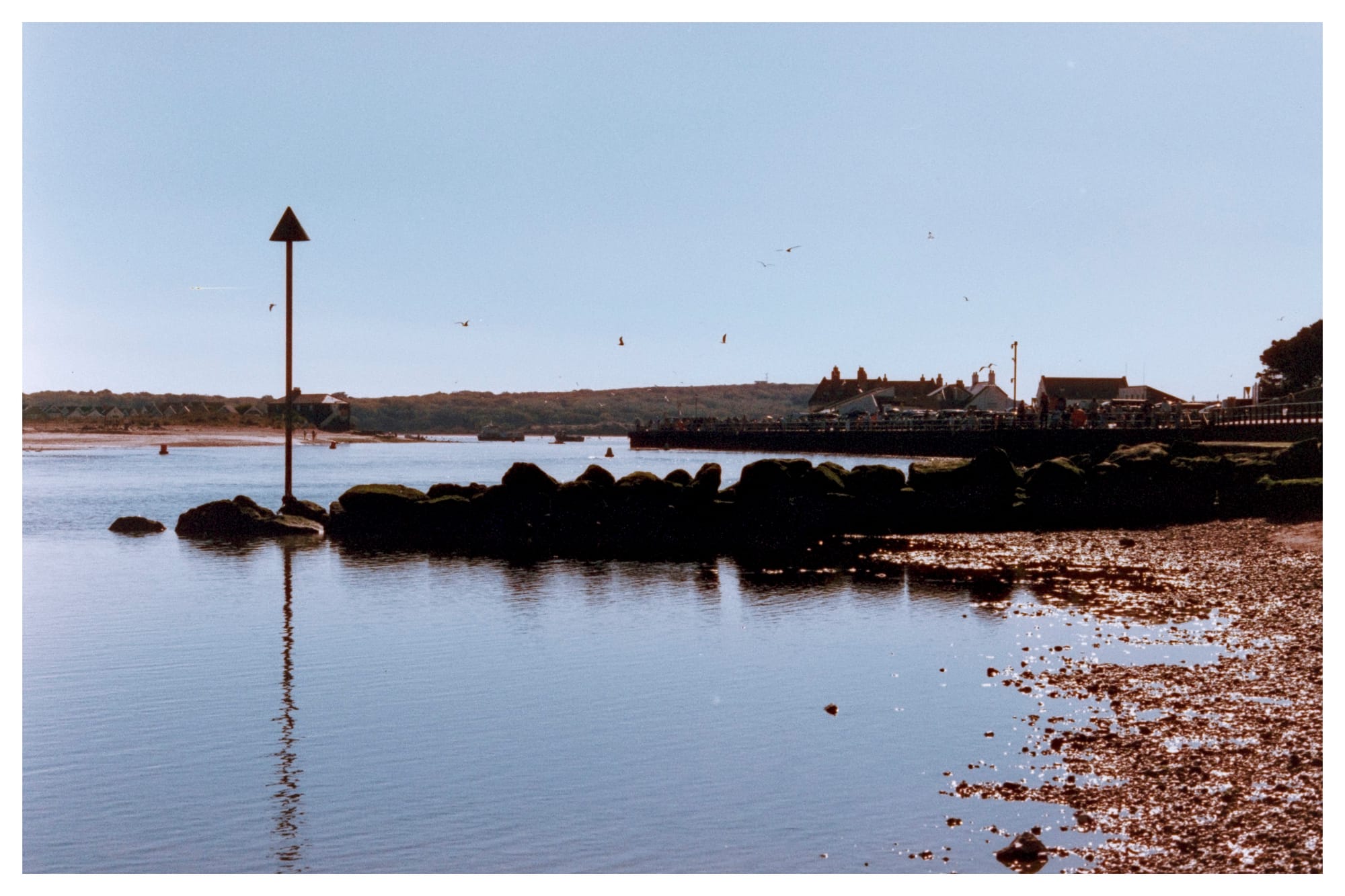
Phoenix 200 has a noticeable grain structure and a bold rendering of colours, particularly blues and reds. Some of the midtone transitions feel compressed, with skies sometimes taking on a denser, almost screen-printed quality. The high contrast makes it less forgiving than Kodak or Fuji emulsions but adds a distinctive punch that some may find appealing for beach scenes and textured environments.
Scanning and Post-Processing
This roll was developed by https://analoguewonderland.co.uk and then 'scanned' / photographed using a Fuji X-T4 on a tripod at ISO 160. I used the XF 60mm f/2.4 macro lens at f/8 to photograph the negatives on a DigitaLIZA Max from https://www.lomography.com. The RAW files were then inverted and processed using Negative Lab Pro in Adobe Lightroom Classic. My digital workflow was minimal—primarily inversion and some increases in exposure (+0.66) to handle Phoenix’s strong contrast profile.
Observations
- Blues are dominant, often leaning cyan. This worked well in sea and sky shots but may need correction in portraiture or shadow areas.
- Red tones can oversaturate, particularly in clothing and signage.
- There is a clear halation effect around high-contrast edges, which some may find adds character but others might see as distracting.
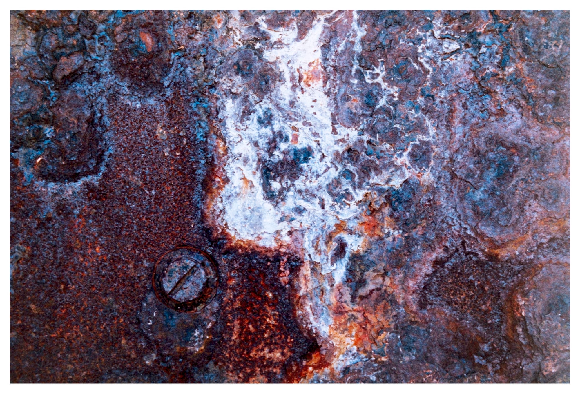
- Grain is really pronounced even at base ISO, more akin to a 400-speed stock in visual texture.
Harman Phoenix 200 is not a fine-grained, neutral colour film. It has a strong personality—vivid, contrast-heavy, and imperfect in ways that can be used creatively. For this test roll, I leaned into its quirks, choosing seaside subjects, rust textures, and backlit scenes to see what the film could offer.
This won’t be my go-to for every subject, but I can see myself using Phoenix again where I want impact over subtlety. It might suit street work, urban colour, or creative portraits in the right light.